Enivo are passionate about loving the land, designing and selling biodegradable plant pots.
Elisa approached Emma Lorraine Design looking to refresh Enivo's visual identity to reflect the heart of loving the land in an industry consumed by plastic options.
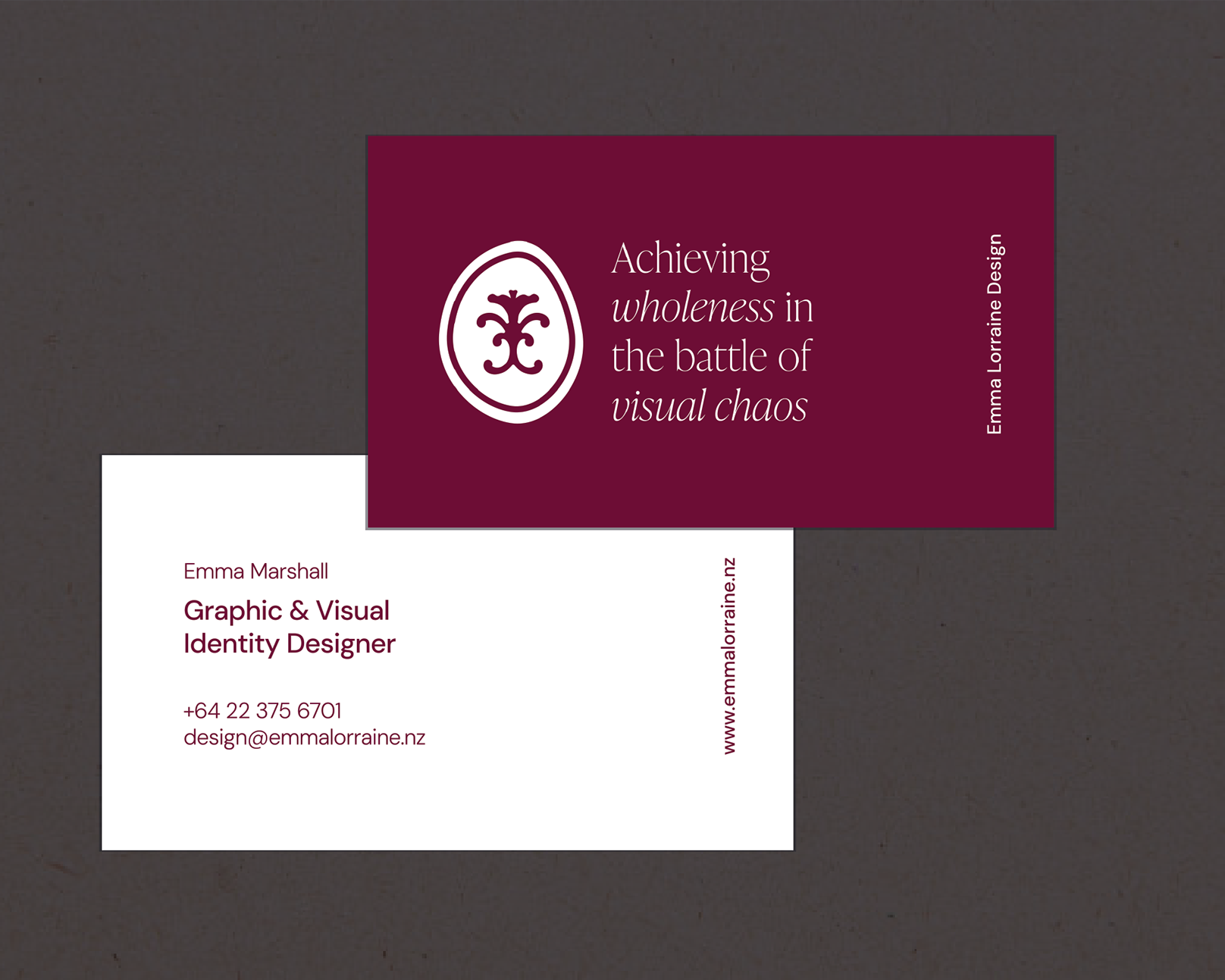
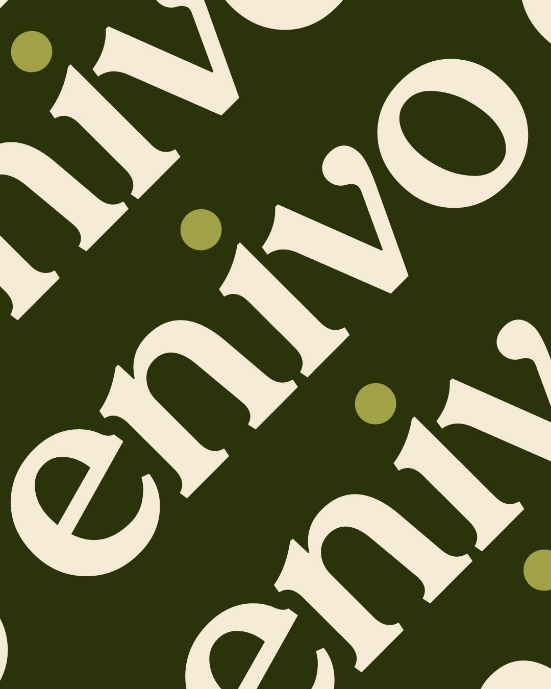
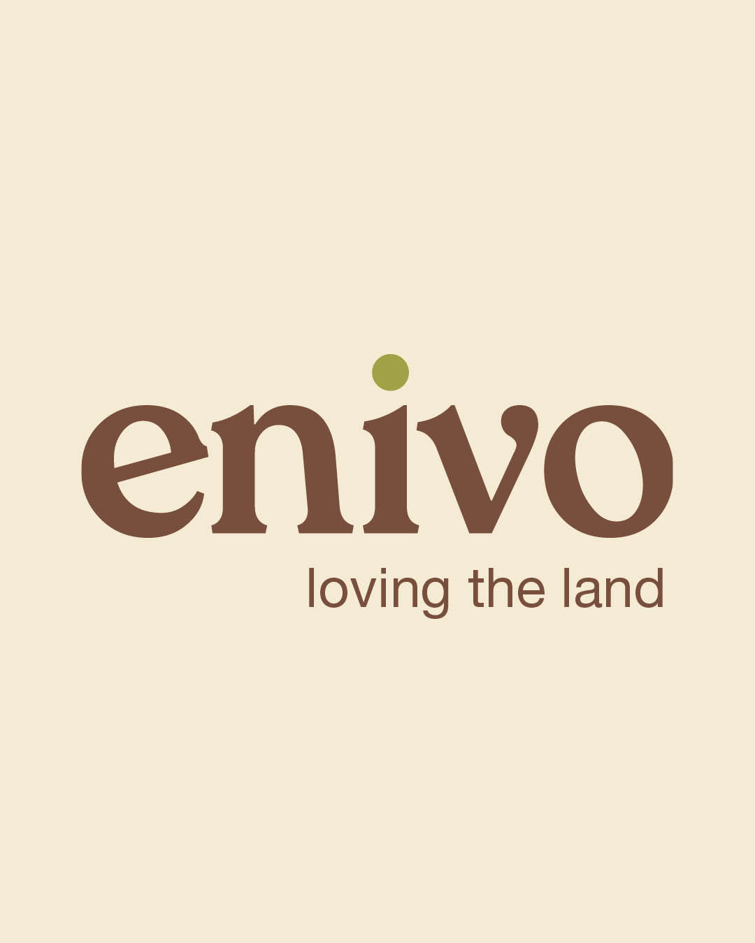
Visual Identity Development
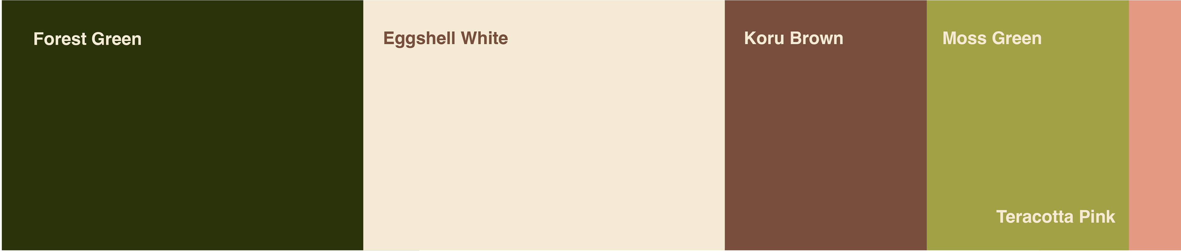
Enivo requested a word mark that communicates stewardship and a love for the land while keeping the brand's name at the front of the consumers mind. Drawing inspiration from the native New Zealand bush, a range of neutral tones were selected. The terracotta pink accent colour acts as a homage to Elisa being a female founder while incorporating tradition within plant pots.
Instagram Tiles
See how @enivo_nz has applied their new visual identity on Instagram
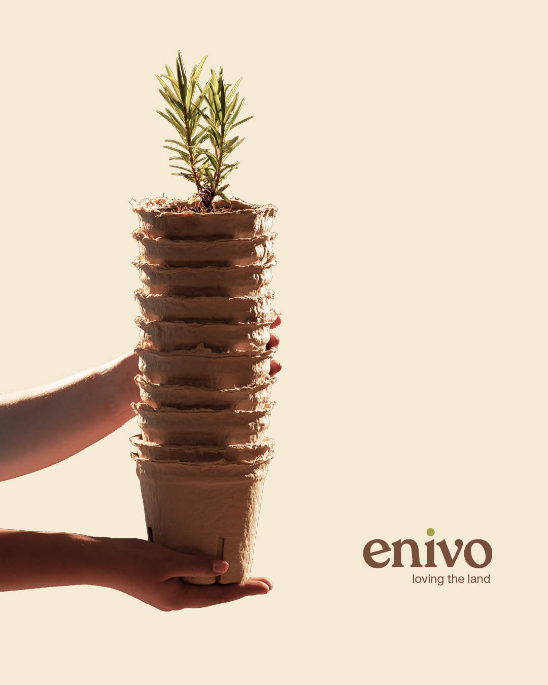
Product Packaging
The sleeve packaging below was designed specifically for the stack of 10 Enivo pots to communicate beyond colours Enivo's heart for the environment. This style of packaging minimizes the amount of material used and eliminates the need for adhesives. This packaging sleeve was produced in house with cut, crease and dye layers, ready to be sent through for print.
Elisa has been pleasantly impacted by the project and continues to share her love for design on her LinkedIn page, sharing that throughout the consultation process she "learnt so much about her own business" and is "beyond happy with what we have now built".